
You’ve probably done this already. You open Canva, swap in a few listing photos, change the address, print a stack, and hope the flyer brings in calls. Then nothing happens. Or worse, someone says they “saw it” and you still have no clue whether it helped, hurt, or did absolutely nothing.
That’s the problem with making real estate flyers. Most agents aren’t failing because flyers are outdated. They’re failing because they were taught to treat flyers like decoration instead of a measurable marketing asset.
A flyer should do one job clearly, get in front of the right people, and give you a way to track what happened next. If it can’t do those three things, it’s not marketing. It’s paper.
Table of Contents
- Why Most Real Estate Flyers End Up in the Trash
- Planning Your Flyer Before Opening Canva
- Anatomy of a High-Converting Real Estate Flyer
- A Smarter Canva Workflow for Busy Agents
- Getting Your Flyer into the Right Hands
- Your Quick-Start Flyer Checklist and CTA Library
Why Most Real Estate Flyers End Up in the Trash
Most flyers fail before they’re printed.
Agents usually blame the headline, the colors, or the template. Those things matter, but they aren’t the main reason a flyer gets ignored. The bigger issue is that most flyers are made without a clear goal, without a specific audience, and without any tracking attached.
That creates a common cycle. You make a flyer, distribute it, get vague feedback, and repeat the same process next month because you can’t prove what worked. Busy solo agents feel this sharply because every hour spent designing is an hour not spent following up, prospecting, or showing property.
One of the clearest gaps in the market is measurement. A common frustration for busy solo agents is not knowing if their flyers are working. 68% of real estate marketers undervalue key metrics like tracking unique QR codes or UTM links, despite a 40% rise in digital-hybrid tracking in major markets over the last year, according to Blastrow’s analysis of real estate flyer performance gaps.
Pretty design doesn’t save weak strategy
A polished flyer can still flop if it asks too much of the reader.
When agents try to make one flyer do everything, the result gets muddy fast. They want to promote the listing, introduce themselves, advertise the open house, build neighborhood authority, and get seller leads all on one page. The reader sees a wall of competing messages and moves on.
Here’s what usually doesn’t work:
- Feature overload: Long lists of upgrades, amenities, and fine print that bury the main takeaway.
- Weak next steps: “Contact me for more info” is vague. People don’t act on vague.
- No path to measurement: If the flyer points to your homepage, your general phone number, and your Instagram bio, you won’t know what generated the lead.
Practical rule: If you can’t answer “What exactly should this flyer produce?” in one sentence, stop designing.
The old playbook is the problem
A lot of flyer advice still lives at the surface level. Use a nice font. Pick clean colors. Add a hero image. Fine. But none of that answers the question that matters most to an agent with a real budget and a real pipeline.
Did this flyer create business?
A modern flyer has to work in two places at once. It should perform as a printed piece and as a digital asset you can repurpose into email, social, and landing page traffic. That’s where the time savings and the ROI show up.
If you’re making real estate flyers in 2026, don’t think like a designer first. Think like a marketer first.
Planning Your Flyer Before Opening Canva
The fastest way to improve a flyer is to delay design for fifteen minutes.
That short planning step saves hours because it forces sharp decisions before you start dragging boxes around. New agents usually skip this because Canva feels productive. It isn’t, at least not until you know what the flyer is supposed to do.

If you want a faster starting point, use a library of real estate marketing templates after you answer the three questions below. Templates save time. They don’t replace strategy.
Start with one goal
Pick one primary action.
Not two. Not five.
A flyer for a starter home listing might have one of these goals:
- Book showings
- Drive QR scans to a property page
- Promote an open house
- Generate seller conversations in the surrounding neighborhood
Those are all valid. They should not live as equal priorities on the same flyer.
A “Just Listed” flyer for first-time buyers usually performs best when it pushes one simple next step, such as scanning for photos, pricing, and showing details. A neighborhood farming flyer aimed at nearby homeowners has a different job. That piece should build trust and start conversations about selling.
Define the audience before the message
The same property needs different wording depending on who receives the flyer.
A starter-home flyer mailed to renters should focus on entry point, convenience, and livability. The version left with neighbors should focus on local demand, buyer interest, and your visibility in the market. Same house, different buyer psychology.
Use this quick filter:
| Audience | What they care about most | What your flyer should emphasize |
|---|---|---|
| First-time buyers | Clarity and ease | Best features, simple CTA, next step |
| Neighbors | Local relevance | New listing, activity nearby, agent credibility |
| Sellers in the area | Proof of positioning | Your marketing quality and presence |
| Open house visitors | Memory after the visit | Key highlights and follow-up path |
If the audience is “everyone,” the flyer usually connects with no one.
Choose one message they should remember
This is the line I push agents to write before anything else:
“What is the one thing someone should remember after three seconds with this flyer?”
For a starter home, it might be:
- Move-in ready and easy to tour
- Best value in the neighborhood
- Walkable location with bright, updated interiors
That message becomes the filter for every decision after that. The headline, image choice, body copy, and CTA should all reinforce it.
Once those three pieces are set, Canva gets easier. You stop experimenting and start assembling.
Anatomy of a High-Converting Real Estate Flyer
The best flyers are easy to scan and hard to forget.
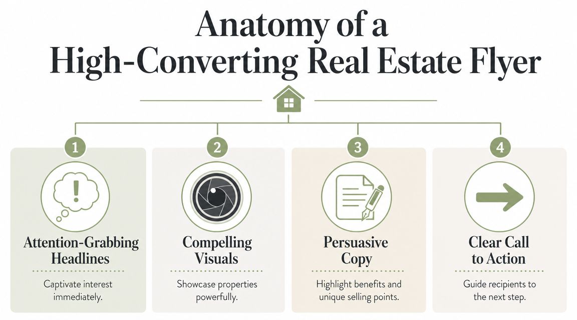
That doesn’t happen by accident. A strong flyer usually gets four things right at once: the headline pulls attention, the copy sells the benefit, the images create desire, and the layout tells the eye where to go next.
Headline first, not address first
A lot of agents lead with the property address in the biggest text on the page. That’s fine when the address itself carries weight. Most of the time, it doesn’t.
Lead with what makes the property worth noticing.
Do this
- Sunlit corner condo with a flexible layout
- Backyard made for summer dinners
- Just listed in a neighborhood buyers keep asking for
Not this
- 1452 Willow Lane
- New property available
- Beautiful home for sale
The address still belongs on the flyer. It just shouldn’t do all the work.
Write benefits, not brochure copy
Body copy gets weak when it reads like MLS remarks pasted into a template.
People respond better when the copy helps them picture life in the property. “Large yard” is generic. “Backyard with room for summer BBQs and a play set” gives the feature a job. “Updated kitchen” is bland. “Bright kitchen with space to cook and host” lands better.
Use short blocks. Keep the reading light. Skip jargon.
A quick before-and-after helps:
| Weak copy | Stronger copy |
|---|---|
| Spacious living room | Open living area with room to host and unwind |
| Close to amenities | Near the spots buyers already use every week |
| Great natural light | Bright interior that feels good the moment you walk in |
Use fewer images, but better ones
When agents ask how to make real estate flyers look more expensive, this is usually the answer. Cut the photo count and improve the quality.
Flyers with high-quality, professional images see 2.5 times higher retention than those with amateur shots, according to Wise Agent’s flyer guide. The same source notes that prominently featuring your agent photo and logo can increase referrals by up to 25%.
That means two practical things:
- Pick one hero image: Usually the exterior or the most emotionally appealing room.
- Use your branding intentionally: Agent photo, logo, and contact details should feel placed, not stuffed in.
A collage of average photos makes a listing feel average. One strong image gives the flyer a center of gravity.
Layout should guide action
A flyer is not a scrapbook. It’s a visual path.
The cleanest layouts usually follow this order:
- Headline
- Hero image
- Short benefit-driven copy
- Key details
- CTA
- Contact and branding
Leave breathing room. Don’t cram every inch. If the flyer feels crowded on your screen, it will feel worse in print.
A few layout rules I give new agents:
- Keep one visual focal point: Don’t let six elements compete for attention.
- Make the CTA obvious: A QR code with a label works better than a floating code with no context.
- Use consistent fonts and spacing: Small inconsistencies make a flyer feel homemade, even when the design is decent.
Making real estate flyers well is mostly subtraction. Cut noise, sharpen the promise, and make the next step impossible to miss.
A Smarter Canva Workflow for Busy Agents
Busy agents don’t need more design freedom. They need fewer decisions.
That’s why I don’t recommend opening a blank Canva file unless you enjoy wasting time. A better workflow starts with a reusable base, a small set of approved brand choices, and one master file that can spin into print and digital versions without rebuilding the whole thing.

Build one repeatable system
The time-saving move in Canva is simple. Create a “starter kit” once, then stop reinventing.
That kit should include:
- A brand kit: Your fonts, colors, logo files, and headshot
- Three flyer masters: One for listings, one for open houses, one for farming
- A CTA block: A prebuilt section for QR code, URL, and contact info
- A digital version frame: Sized for email or social reuse
If you’ve never set that up, a visual walkthrough like this Canva template editing tutorial can speed up the setup.
Create the print version first
Start with the print file because it forces cleaner decisions.
Printed flyers punish clutter. Tiny text, weak contrast, and crowded layouts become obvious fast. If the print piece is clear, the digital version is usually easy to adapt.
Keep a short production checklist beside you:
- Bleed enabled: So edges print cleanly
- High-resolution photos: Avoid soft or pixelated listing shots
- Consistent margins: Keep text away from trim edges
- Export as PDF for print: This reduces last-minute surprises
The file that takes the longest should be the first one. Every version after that should be a resize, not a redesign.
Repurpose the same flyer for digital
Once the print file is done, duplicate it.
Then strip it down for screen use. On digital, people move faster. They need less text, larger focal points, and stronger contrast. Your flyer can become:
- an Instagram carousel slide
- a Facebook post image
- a simple email graphic
- a vertical story or short video frame
Most agents save serious time. Instead of creating separate campaigns, they create one strong asset and adapt it.
A quick demo helps if you want to see editing in motion:
Keep your tech choices boring
You do not need a complicated design stack.
Canva is enough for most agents if the workflow is disciplined. The mistake isn’t using Canva. The mistake is treating every flyer like a custom art project. Your clients don’t care how original the layout was. They care whether the marketing looked polished and whether it got them results.
The best Canva workflow is boring, fast, and repeatable. That’s a compliment.
Getting Your Flyer into the Right Hands
Distribution is where good flyers become useful or invisible.
A polished flyer sitting on your desktop does nothing. The key decision is where it goes, who sees it, and what happens after they do. For most agents, the right answer isn’t print or digital. It’s choosing the lead channel based on the goal, then using the other channel to support it.

Print works best when the audience is local and specific
If your target is a neighborhood, nearby homeowners, or a defined house list, print still has serious value.
According to the Data & Marketing Association data cited by Wise Pelican’s direct mail breakdown, direct mail flyers can reach an average response rate of 9% for house lists, and 79% of consumers either keep, pass on, or glance at a flyer. That matters in real estate because physical visibility lasts longer than a post that disappears in a feed.
Use print when the job is local:
- Just listed door drops: Best for building immediate neighborhood awareness
- Open house invites: Good when proximity matters
- Farming pieces: Best when repeated exposure is part of the strategy
Print tends to underperform when the list is broad, random, or poorly matched to the property.
Digital works best when speed and follow-up matter
Digital distribution wins when the next step lives online.
If your flyer drives people to a landing page, video tour, registration form, or listing inquiry flow, digital makes follow-up easier. The same flyer can become a carousel, email graphic, story slide, or boosted local post.
A simple framework helps:
| Goal | Best primary channel | Best support channel |
|---|---|---|
| Promote an open house | Social | |
| Drive listing page traffic | Social or email | |
| Build neighborhood recognition | ||
| Capture seller leads | Print or email | Landing page |
If you want to connect offline interest to online lead capture, send traffic to a dedicated real estate landing page instead of your generic homepage.
Track every flyer like a campaign
This is the part most agents skip, and it’s the reason they keep guessing.
Every flyer should have one trackable path:
- A unique QR code
- A dedicated landing page URL
- A campaign-specific contact route
- A unique CTA tied to one offer
Don’t send one flyer to your homepage, your main Instagram, and your standard office number all at once. That muddies attribution. Pick one main response path and make it easy to monitor.
If you can’t tell which flyer produced the lead, you can’t improve the next campaign.
Repurpose instead of restarting
A strong flyer should live more than one life.
The print version becomes a social carousel. The headline becomes an email subject line. The CTA becomes a story slide. The hero image becomes the post thumbnail. This is how agents keep consistency without creating new assets from scratch every time.
The channel mix doesn’t have to be complicated. It just has to be intentional.
Your Quick-Start Flyer Checklist and CTA Library
Most agents don’t need more advice on making real estate flyers. They need a checklist they can use on a Tuesday between appointments.
Here’s the one I’d hand a new agent in the office.
The quick-start checklist
- Pick one goal: Decide the single action this flyer should generate.
- Name the audience: Write down exactly who should receive it.
- Lock the message: Choose the one thing they should remember.
- Choose one hero image: Use the strongest professional photo available.
- Write benefit-led copy: Translate features into lived experience.
- Keep the layout clean: Make the path from headline to CTA obvious.
- Add clear branding: Include agent photo, logo, and direct contact details.
- Use one trackable response path: QR code, landing page, or dedicated follow-up route.
- Repurpose the asset: Resize the finished design for email and social.
- Review results: Keep notes on scans, inquiries, and conversations created.
When the strategy, design, and distribution line up, flyers can do real work. Executed correctly with professional design and targeted distribution, real estate flyer campaigns can yield 3x-29x ROI, with one documented case showing a $1,200 investment generating two listings, 14 buyer leads, and a $32,000 commission, based on Flyer Canada’s real estate campaign analysis.
A simple headline swipe file
Use these as starting points, then tailor them to the property and audience.
- Just listed in a neighborhood buyers keep watching
- A home that lives as well as it looks
- Tour this one before the weekend is gone
- New to market and ready for its next chapter
- The kind of layout buyers ask for
- Open house this weekend
- Thinking of selling nearby
- See what’s moving in your neighborhood
CTA lines that don’t sound flat
A weak CTA kills a good flyer. Use direct language.
- Scan for price, photos, and showing details
- Book your private tour today
- See the full property gallery
- Get the neighborhood details here
- Want results like this for your home
- Curious what your home could sell for
- Join us at the open house
- Call to ask about similar homes coming soon
Good flyers don’t try to say everything. They make one clear promise and one clear ask.
If you want better results from flyers, don’t start with fonts. Start with purpose, simplify the message, and track the response. That’s the difference between marketing that feels busy and marketing that compounds.
If you want the shortcut instead of building all of this from scratch, Restate Social gives real estate agents ready-to-use templates, marketing assets, and a full monthly system built to save time and keep your branding consistent. It’s a practical way to stop guessing, stop overdesigning, and start publishing marketing that’s ready to use.